


Block definitions describe how a block looks and behaves, including the text, the colour, the shape, and what other blocks it can connect to.
Once the custom blocks are defined, each platform loads these definitions in different ways, detailed in web and Android specific configuration guides.
JSON format versus JavaScript API
Blockly has two ways of defining blocks: JSON objects and JavaScript functions. The JSON format is cross-platform so that the same code may be used to define blocks on web, Android, and iOS. Additionally, the JSON format is designed to simplify the localization process when developing for languages with different word orderings. The JSON format is the preferred method of defining blocks.
However, the JSON format does not able to directly define advanced features such as mutators or validators. These must be written in the platform's native code, JavaScript, Java, or Swift, usually as extensions.
Apps using the original JavaScript implementation of Blockly can also write block definitions directly to the lower level Blockly API function calls, shown in the various JavaScript examples below.
JSON
JavaScript
{
  "type": "string_length",
  "message0": 'length of %1',
  "args0": [
    {
      "type": "input_value",
      "name": "VALUE",
      "check": "String"
    }
  ],
  "output": "Number",
  "colour": 160,
  "tooltip": "Returns number of letters in the provided text.",
  "helpUrl": "http://www./jsref/jsref_length_string.asp"
}
Both examples load the same 'string_length' block.

On the web, the JSON format is loaded using the initJson function.
This also allows mixing the two formats in Blockly webpages. It is
preferred to define your block with JSON wherever possible, and use JavaScript
only for parts of block definitions that JSON does not support.
Below is an example of a block that is predominantly defined using JSON, but is extended using the JavaScript API to feature a dynamic tooltip.
JavaScript
var mathChangeJson = {
  "message0": "change %1 by %2",
  "args0": [
    {"type": "field_variable", "name": "VAR", "variable": "item", "variableTypes": [""]},
    {"type": "input_value", "name": "DELTA", "check": "Number"}
  ],
  "previousStatement": null,
  "nextStatement": null,
  "colour": 230
};

Blockly.Blocks['math_change'] = {
  init: function() {
    this.jsonInit(mathChangeJson);
    // Assign 'this' to a variable for use in the tooltip closure below.
    var thisBlock = this;
    this.setTooltip(function() {
      return 'Add a number to variable "%1".'.replace('%1',
          thisBlock.getFieldValue('VAR'));
    });
  }
};
Block colour
The primary colour of a block is defined by the JSON colour property, or the
block.setColour(..) function.
JSON
JavaScript
{
  // ...,
  "colour": 160,
}
See the block colour guide for more details.
Statement Connections
Users can create sequences of blocks using the nextStatement and
previousStatement connectors. In Blockly's standard layout, these connections
are on the top and the bottom, with the blocks stacked vertically.
A block with a previous connector cannot have an output connector, and vice versa. The term statement block refers to a block with no value output. A statement block will usually have both a previous connection and a next connection.
nextStatement and previousStatement connections can be
typed,
but this feature is not utilized by standard blocks.
Next Connection
Creates a point at the bottom of the block, so that other statements can be stacked below it. A block with a next connection but no previous connection usually represents an event, and can be configured to render with a hat.

JSON
JavaScript
Untyped:
{
  ...,
  "nextStatement": null,
}
Typed (rare):
{
  "nextStatement": "Action",
  ...
}
Previous Connection
Creates a notch at the top of the block, so that it can be connected as a stack of statements.
Blocks with a previous connection cannot have an output connection.

JSON
JavaScript
Untyped:
{
  ...,
  "previousStatement": null,
}
Typed (rare):
{
  "previousStatement": "Action",
  ...
}
Block Output
A block may have a single output, represented as a male jigsaw connector on the leading edge. Outputs connect to value inputs. Blocks with an output are usually called value blocks.

JSON
JavaScript
Untyped:
{
  // ...,
  "output": null,
}
Typed:
{
  // ...,
  "output": "Number",
}
Blocks with an output connector cannot also have a previous statement notch.
Block Inputs
A block has one or more inputs, where each input is a sequence of labels and fields that may end in a connection. There are three types of inputs, matching the connection types:
- Value input: Connects to a output connection of a
value block. A
math_arithmeticblock (addition, subtraction) is an example of a block with two value inputs. - Statement input: Connects to a previous connection of a statement block. The nested section of a while loop is an example of a statement input.
- Dummy input: Does not have a block connection. Acts like a newline when the block is configured to use external value inputs.

The JSON format and JavaScript API use slightly different models to describe their inputs.
Inputs and Fields in JSON
JSON defined blocks are structured as a sequence of interpolated
message strings ( message0, message1, ...), where each interpolation token
(%1, %2, ...) is a field or an input end (thus where the input connector
renders, within the message) in the matching JSON argsN array. This format is
intended to make internationalization easy.
JSON
{
  "message0": "set %1 to %2",
  "args0": [
    {
      "type": "field_variable",
      "name": "VAR",
      "variable": "item",
      "variableTypes": [""]
    },
    {
      "type": "input_value",
      "name": "VALUE"
    }
  ]
}

The interpolation tokens must match the args0 array completely: no duplicates,
no omissions. Tokens may be present in any order, which allows different
languages to change the layout of the block.
Text on either side of an interpolation token is whitespace-trimmed.
Text using the character % (e.g. when referring to a percentage) should use
%% so that it is not interpreted as an interpolation token.
The order of the arguments and the argument types define the shape of the
block. Changing one of these strings can completely change the block's layout.
This is particularly important in languages that have a different word order
than English. Consider a hypothetical language where "set %1 to %2" (as used
in the example above) needs to be reversed to say "put %2 in %1". Changing
this one string (and leaving the rest of the JSON
untouched) results in the following block:
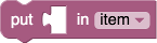
Blockly automatically changed the order of the fields, created a dummy input, and switched from external to internal inputs.
Args
Each message string is paired with an args array of the same number. For
example, message0 goes with args0. The interpolation tokens
(%1, %2, ...) refer to the items of the args array. Every object has a
type string. The rest of the parameters vary depending on the type:
- Fields:
field_inputfield_dropdownfield_checkboxfield_colourfield_numberfield_anglefield_variablefield_datefield_labelfield_image.- Inputs:
input_valueinput_statementinput_dummy
Every object may also have an alt field. In the case that Blockly does not
recognize the object's type, then the alt object is used in its place. For
example, if a new field named field_time is added to Blockly, blocks using
this field could use alt to define a field_input fallback for older versions
of Blockly:
JSON
{
  "message0": "sound alarm at %1",
  "args0": [
    {
      "type": "field_time",
      "name": "TEMPO",
      "hour": 9,
      "minutes": 0,
      "alt":
        {
          "type": "field_input",
          "name": "TEMPOTEXT",
          "text": "9:00"
        }
    }
  ]
}
An alt object may have its own alt object, thus allowing for chaining.
Ultimately, if Blockly cannot create an object in the args0 array (after
attempting any alt objects) then that object is simply skipped.
A dummy input will be automatically added to the end of the block if the
message string ends with text or fields that are not contained by an input.
Thus if the last input on a block is a dummy input then it may be omitted from
the args array and it does not need interpolation into message. The
automatic addition of a tailing dummy input allows translators to change
message without needing to modify the rest of the JSON. See the example of
"set %1 to %2" (no dummy input) and "put %2 in %1" (dummy input added)
earlier on this page.
lastDummyAlign0
In rare cases the automatically created trailing dummy input needs to be aligned
to the "RIGHT" or "CENTRE". The default if not specified is "LEFT".
In the example below message0 is "send email to %1 subject %2 secure %3"
and Blockly automatically adds a dummy input for the third row. Setting
lastDummyAlign0 to "RIGHT" forces this row to be right aligned.

When designing blocks for RTL (Arabic and Hebrew), left and right are reversed.
Thus "RIGHT" would align fields to the left.
message1, args1, lastDummyAlign1
Some blocks are naturally divided into two or more separate parts. Consider this repeat block which has two rows:
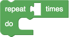
If this block were described with a single message, the message0 property
would be "repeat %1 times %2 do %3". This string is awkward for a translator,
it is difficult to explain what the %2 substitution means. The %2 dummy
input may also not even be desired in some languages. And there may be multiple
blocks that wish to share the text of the second row. A better approach
is for JSON to use more than one message and args properties:
JSON
{
  "type": "controls_repeat_ext",
  "message0": "repeat %1 times",
  "args0": [
    {"type": "input_value", "name": "TIMES", "check": "Number"}
  ],
  "message1": "do %1",
  "args1": [
    {"type": "input_statement", "name": "DO"}
  ],
  "previousStatement": null,
  "nextStatement": null,
  "colour": 120
}
Any number of message, args, and lastDummyAlign properties may be defined
in the JSON format, starting with 0 and incrementing sequentially. Note that
the Block Factory is not capable of splitting messages into multiple parts, but
doing so manually is straightforward.
Inputs and Fields in JavaScript
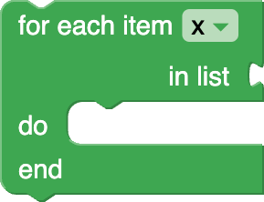
The JavaScript API includes an append method for each input type:
JavaScript
this.appendDummyInput()
    .appendField('for each')
    .appendField('item')
    .appendField(new Blockly.FieldVariable());
this.appendValueInput('LIST')
    .setCheck('Array')
    .setAlign(Blockly.ALIGN_RIGHT)
    .appendField('in list');
this.appendStatementInput('DO')
    .appendField('do');
Each method can take an identifier string, used by code generators. Dummy inputs rarely need referencing and the identifier is usually left unset.
As seen above, each method returns the input object for configuration through method chaining. There are three functions that are used for configuring inputs.
setCheck
JavaScript
input.setCheck('Number');
This optional function is used for type-checking of connected inputs. If given an argument of null, the default, then this input may be connected to any block. See Type Checks for details.
setAlign
JavaScript
input.setAlign(Blockly.ALIGN_RIGHT);
This optional function is used to align the fields (see below). There are three
self-descriptive values which may be passed as an argument to this function:
Blockly.ALIGN_LEFT, Blockly.ALIGN_RIGHT, and Blockly.ALIGN_CENTRE.
Note the British spelling of 'centre'. Left alignment is the default.
When designing blocks for RTL (Arabic and Hebrew), left and right are reversed.
Thus Blockly.ALIGN_RIGHT would align fields to the left.
appendField
Once an input has been created and appended to a block with appendInput, one
may optionally append any number of fields to the input. These fields
are often used as labels to describe what each input is for.
JavaScript
input.appendField('hello');

The simplest field element is text. Blockly's convention is to use all lowercase text, with the exception of proper names (e.g. Google, SQL).
An input row can contain any number of field elements. Multiple appendField
calls may be chained together to efficiently add several fields to the same
input row.
JavaScript
input.appendField('hello')
     .appendField(new Blockly.FieldLabel('Neil', 'person'));
The appendField('hello') call is actually a shortcut for using an explicit
FieldLabel constructor: appendField(new Blockly.FieldLabel('hello')).
The only time one would wish to use the constructor is when specifying a
class name so that the text may be styled using a CSS rule.
Inline vs. External
Block inputs can render as either external or internal.
The block definition can specify an optional boolean controlling whether inputs
are inline or not. If false then any value inputs will be external (such as
the left block). If true then any value inputs will be inline (such as the
right block above).
JSON
JavaScript
{
  // ...,
  "inputsInline": true
}
If not defined then Blockly will use some heuristics to guess which mode is
best. Assuming Blockly makes the right choice, leaving this field undefined
is preferable since different language translations can automatically have
different modes. See the JSON example of "set %1 to %2" (external inputs) and
"put %2 in %1" (inline inputs) earlier on this page.
Use inline inputs when a block is likely to have small inputs such as numbers.
The user can toggle this option through the context menu, if the collapse
configuration is enabled (defaults to true if the toolbox has categories).
Fields
Fields define the UI elements within a block. These include the string labels,
images, and inputs for
literal data
such as strings and numbers. The simplest example is the math_number block,
either a field_input (web) or field_number (Android) to type a number.
Most fields have a name string used to reference them during code generation.
Label
Label strings provide context to the other fields and inputs. They are so common and intrinsic to translation, they have their own notation.
JSON
JavaScript
{
  "type": "example_label",
  "message0": "a label %1 and another label",
  "args0": [
    {
      "type": "input_dummy"
    }
  ]
}
Any message text between interpolation arguments becomes label strings. Alternatively, labels may be interpolated explicitly, either as an object or as text.
{
  "type": "example_label",
  "message0": "%1 %2 %3",
  "args0": [
    {
      "type": "field_label",
      "text": "a label"
    },
    {
      "type": "input_dummy"
    },
    "and another label"
  ]
}
When added explicitly, authors can include a CSS style name to customize the view on Blockly for Web.
JSON
JavaScript
{
  "type": "example_styled_label",
  "message0": "%1",
  "args0": [
    {
      "type": "field_label",
      "text": "Styled label",
      "class": "style-name"
    }
  ]
}
Image
Like labels, images are usually static indicators instead of input fields.
JSON
JavaScript
{
  "type": "example_image",
  "message0": "image: %1",
  "args0": [
    {
      "type": "field_image",
      "src": "https://www./codesite/ph/images/star_on.gif",
      "width": 15,
      "height": 15,
      "alt": "*"
    }
  ]
}
The FieldImage object is created with the image URL and the desired height and
width. The image will be scaled to within the specified dimensions, while
preserving the aspect ratio. The block will expand as needed to accommodate the
image. An optional fourth argument specifies the alternate text for use when the
block is collapsed.
The image URL can be relative. On web, relative URLs are resolved relative to hosting page's URL. On Android, the relative URL is treated as an asset path. On iOS, a relative URL must be a simple file name (no path) and will be resolved as a file in the application bundle.
Text Field
Text input allows the user to input text.
JSON
JavaScript
{
  "type": "example_textinput",
  "message0": "text input: %1",
  "args0": [
    {
      "type": "field_input",
      "name": "FIELDNAME",
      "text": "default text"
    }
  ]
}
Optionally, the JavaScript FieldTextInput constructor can also take a second
argument which becomes the validation function or change handler. See
math_number for an example of where the user's input is rewritten.
By default, text input input is spell checked, but can be optionally turned off:
JSON
JavaScript
{
  "type": "example_nospellcheck",
  "message0": "no spell check: %1",
  "args0": [
    {
      "type": "field_input",
      "name": "FIELDNAME",
      "text": "default text",
      "spellcheck": false
    }
  ]
}
Drop-down Field
JSON
JavaScript
{
  "type": "example_dropdown",
  "message0": "drop down: %1",
  "args0": [
    {
      "type": "field_dropdown",
      "name": "FIELDNAME",
      "options": [
        [ "first item", "ITEM1" ],
        [ "second item", "ITEM2" ]
      ]
    }
  ]
}
The items list of the drop-down field is specified by a list of two-part lists. The first item of each inner list is the human readable name; the second is the item identifier string.
In Blockly for Web, if all of the human readable strings share the some prefix or suffix, those strings will extracted as a label before or after the drop down. This allows the prefix/suffix label place to adapt to language conventions. This feature will be ported to Android in the near future.
Checkbox Field
A checkbox field provides a boolean input.
JSON
JavaScript
{
  "type": "example_checkbox",
  "message0": "checkbox: %1",
  "args0": [
    {
      "type": "field_checkbox",
      "name": "FIELDNAME",
      "checked": true
    }
  ]
}
Colour Picker Field
The colour picker allows the user to select from a set of opaque colours provided by the programmer.
JSON
JavaScript
{
  "type": "example_colour",
  "message0": "colour picker: %1",
  "args0": [
    {
      "type": "field_colour",
      "name": "FIELDNAME",
      "colour": "#ff0000"
    }
  ]
}
Optionally, the JavaScript FieldColour constructor can also take a second
argument which becomes the validation function or change handler.
In web Blockly, the selection of colours and number of columns displayed in all colour pickers can be set globally:
JavaScript
Blockly.FieldColour.COLOURS = ['#f00','#0f0','#00f','#000','#888','#fff'];
Blockly.FieldColour.COLUMNS = 3;
Alternatively, an individial colour picker can be given a custom selection:
JavaScript
var colour = new Blockly.FieldColour('#ff0000');
colour.setColours(['#f00','#0f0','#00f','#000','#888','#fff']).setColumns(3);
input.appendField(colour, 'COLOUR');
Use any CSS-compatible format for the list of colours, including #f00,
#ff0000, or rgb(255, 0, 0).
Variable Field
Another field element is a variable selection menu. The field defines the
default variable name to use (in this case 'x'). If this name is omitted,
the variable will be a new unique variable (e.g. 'i', 'j', 'k' ...).
JSON
JavaScript
{
  "type": "example_variable",
  "message0": "variable: %1",
  "args0": [
    {
      "type": "field_variable",
      "name": "FIELDNAME",
      "variable": "x"
    }
  ]
}
Number Field
Number fields provide number input and validation. In mobile environments, unlike normal text inputs, this can bring up a number pad for the on-screen keyboard.
JSON
JavaScript
{
  "type": "example_number",
  "message0": "number: %1",
  "args0": [
    {
      "type": "field_number",
      "name": "FIELDNAME",
      "value": 100
    }
  ]
}
Using additional parameters, numeric input can be constrained in a number
of ways. The range can be constrained by min and max values. Setting
precision (usually a power of 10) enforces a minimum step between values. That
is, the user's value will rounded to the closest multiple of precision. The
least significant digit place is inferred from the precision. Integers values
can be enforces by choosing an integer precision.
JSON
JavaScript
{
  "type": "example_byte",
  "message0": "%1",
  "args0": [
    {
      "type": "field_number",
      "name": "VALUE",
      "value": 0,
      "min": -128,
      "max": 127,
      "precision": 1
    }
  ]
}
Some combinations of constraints are invalid, and should be avoided. For example, a range of 1 to 4 with a precision of 5 has no valid values.
Optionally, the JavaScript FieldNumber constructor can also take a fifth
argument which becomes the validation function or change handler.
Angle Field
Angle fields present a UI to graphically select an angle.
By default, this is from 0° (inclusive) to 360° (exclusive) counter-clockwise, with 0° to the right, and 90° to the top. Out of bound values are wrapped onto this scale. Any angle (even fractional) can be entered with the keyboard, but angles selected with the mouse are rounded to 15°.
JSON
JavaScript
{
  "type": "example_angle",
  "message0": "angle: %1",
  "args0": [
    {
      "type": "field_angle",
      "name": "FIELDNAME",
      "angle": "90"
    }
  ]
}
Optionally, the JavaScript FieldAngleInput constructor can also take a
second argument which becomes the validation function or change handler.
In the web version, the range and mapping of number to represented angle can be
customized via the constants in
field_angle.js.
Such customizations should be identical on all versions of Blockly that share
saved workspaces.
Date Field
JSON
JavaScript
{
  "type": "example_date",
  "message0": "date: %1",
  "args0": [
    {
      "type": "field_date",
      "name": "FIELDNAME",
      "date": "2020-02-20"
    }
  ]
}
The FieldDate presents a calendar date. It is initialized with a specific
date, or today's date if no date is specified.
Optionally, the JavaScript FieldDate constructor can also take a second
argument which becomes the validation function or change handler.
Note that due to its limited use and large footprint, FieldDate is not
compiled into Blockly by default. Add goog.require('Blockly.FieldDate')
to your project to enable it.
Tooltips
Tooltips offer instant help when the user hovers their mouse over the block. If the text is long, it will wrap automatically.
JSON
JavaScript
{
  // ...,
  "tooltip": "Tooltip text."
}
In the JavaScript API, tooltips can also be defined as a function instead of a
static string. This allows for dynamic help. See math_arithmetic for an
example of a tooltip that changes depending on which dropdown option has been
chosen.
JavaScript
Blockly.Blocks['math_arithmetic'] = {
  init: function() {
    // ...

    // Assign 'this' to a variable for use in the tooltip closure below.
    var thisBlock = this;
    this.setTooltip(function() {
      var mode = thisBlock.getFieldValue('OP');
      var TOOLTIPS = {
        'ADD': Blockly.Msg.MATH_ARITHMETIC_TOOLTIP_ADD,
        'MINUS': Blockly.Msg.MATH_ARITHMETIC_TOOLTIP_MINUS,
        'MULTIPLY': Blockly.Msg.MATH_ARITHMETIC_TOOLTIP_MULTIPLY,
        'DIVIDE': Blockly.Msg.MATH_ARITHMETIC_TOOLTIP_DIVIDE,
        'POWER': Blockly.Msg.MATH_ARITHMETIC_TOOLTIP_POWER
      };
      return TOOLTIPS[mode];
    });
  }
};
Using the JavaScript API, blocks can specify a function, instead of a static
string, which returns a the tooltip string. This allows for dynamic tooltips.
See math_arithmetic for an example.
Help URL
Blocks can have a help page associated with them. This is available to the
users of Blockly for Web by right-clicking the block and selecting "Help"
from the context menu. If this value is null then the menu will be greyed
out.
JSON
JavaScript
{
  // ...,
  "helpUrl": "https://en./wiki/For_loop"
}
Using the JavaScript API, blocks can specify a function, instead of a static string, which returns a URL string, thus allowing for dynamic help.
Change Listeners and Validators
Blocks can have change listener functions that are called on any change to the workspace (including those unrelated to the block). These are primarily used to set the block's warning text, or similar user notification outside the workspace.
The function is added by calling setOnChange with a function and can be done during init or via a JSON extension if you plan to use it on all platforms.
JSON
JavaScript
{
  // ...,
  "extensions":["warning_on_change"],
}

Blockly.Extensions.register('warning_on_change', function() {
  // Example validation upon block change:
  this.setOnChange(function(changeEvent) {
    if (this.getInput('NUM').connection.targetBlock()) {
      this.setWarningText(null);
    } else {
      this.setWarningText('Must have an input block.');
    }
  });
});
The system calls the function, passing in the
change event.
Inside the function, this refers to the block instance.
Because the function is called on any change, if used, developers should ensure the listener runs quickly. One should also be wary of changes to the workspace that might cascade or loop back to the listener.
See the controls_flow_statements, logic_compare, and procedures_ifreturn
blocks for examples.
Note that editable fields have their own event listeners for input validation and causing side effects.
Mutator
Mutators allow advanced blocks to change shape, most notably as a result of
users opening a dialog to add, remove, or rearrange components. Mutators may be
added through JSON with the mutator key.
JSON
{
  // ...,
  "mutator":"if_else_mutator"
}
Per-block configuration
Block instances have a number of properties that configure how they behave to the user. These can be used to constrain the workspace to reflect certain properties of the domain (e.g., there is exactly one 'start' event), or focus the user's effort (e.g., a tutorial).
Deletable State
By default, the user can delete any block on an editable workspace (not
readOnly). Sometimes it is useful to make certain blocks permanent fixtures.
For example, tutorial skeleton code.
block.setDeletable(false);
Any block, including those marked undeletable, may be deleted programmatically:
JavaScript (Web)
Java (Android)
block.dispose();
blocklyController.removeBlockTree(block);
Editable State
block.setEditable(false); // Web or Android
When set to false, the user will not be able to change the block's fields (e.g. dropdowns and text inputs). Blocks default to editable on an editable workspace.
Movable State
block.setMovable(false); // Web or Android
When set to false, the user will not be able to move the block directly. An immovable block that is a child of another block may not be disconnected from that block, though it will move with its parent if the parent is moved.
Blocks default to movable on an editable workspace.
Any block (even immovable ones) may be moved programmatically once it is on a
workspace. In JavaScript, call block.moveBy(dx, dy). The starting
position for a block on a workspace defaults to (0, 0) unless otherwise
specified.
Block data (web only)
this.data = '16dcb3a4-bd39-11e4-8dfc-aa07a5b093db'; // Web only
Data is an optional and arbitrary string that is attached to the block.
When saved as XML the data string is stored in a <data></data> tag so that
it may be round-tripped back to a block. Use the data string to associate a
block with an external resource or for any other custom purpose.
Note that if a block is duplicated or copy/pasted the data string is also duplicated. Undeletable blocks cannot be duplicated or copy/pasted.


